


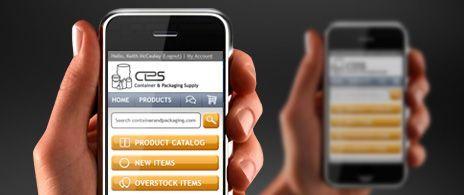
Sneak peek at smartphone-friendly CPS website due in August
This is pretty big news … in fact, we’re so excited about launching our new device-friendly mobile website that I’m telling you a month early! I wanted to give you enough time to go out and buy some fireworks, champagne, paper-mache kits, or whatever it is you get when it’s time to celebrate.
To date, you’ve been able to browse, shop and buy online via your desktop, your laptop, and your tablet. Sure you can shop our site with your iPhone or Droid, but NOW your shopping experience has been optimized for your smartphone.
Watch our promo vid on what CPS Mobile can do for you.
Here’s a quick sneak peek at what’s coming in August.
Clean and thumb-friendly design
Opposable thumbs really give us humans a leg-up in the food chain. They’re also indispensable when it comes to operating a mobile website. We wanted all thumbs (big and small) to have an easy time using our site.
Fresh and zippy functionality
CPS Mobile is built with device-friendly programming language. It’s fresh and fast, and SO easy to navigate that your thumbs will have a hard time keeping up. Clutter-Be-Gone ® was used with ruthless precision; the result is a highly responsive site.
Powerful and accessible tools
If you’ve ordered with us before and have a login, you can manage your account from your phone (check order history, payments, reorder lists, etc). You’ve also got access to tap-to-call, advanced search, quick search, video, the CPS Blog and more.
Stay tuned … we’re launching in August. Like us on facebook, sign up for our newsletter, or keep your eye on the CPS Blog for the grand unveiling of CPS Mobile in August.
 Back To Top