


Color affects your buyers, pick the right color for your product


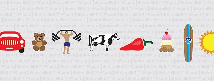
Color is everywhere and it impacts decisions you make everyday. What does it mean? How can you maximize impact? Why are people more relaxed in green rooms? Why do weightlifters do their best in blue gyms? What colors in which constructs can maximize impact?
Color psychology is the study of how color affects you. And when you’ve got less than three seconds to catch a shopper’s eye, picking the right colors is imperative.
Yellow is the most noticeable color. It is also the hardest color for the human eye to process. If you’re wanting your product to catch consumers’ eyes, yellow seems like a good idea; and if you are selling a citrus-based product, then yellow makes sense. However, using yellow to catch the eye for a calming lavendar-scented lotion may not be the best idea. Yellow is energy. Blues and purples are soothing and calming. Read more about the psychology of color below:
 Black is the color of power and authority. Black is popular in clothing and fashion because it has a slimming effect. It can also denote submission (priests showing submission to God), evil (in the case of villains), decay and death. It is also the “go to” color for almost everything because, like white, it is the ultimate neutral.
 White symbolizes purity, innocence and simplicity. White can be partnered with any color because, like black, it is the ultimate neutral. White clears the mind, and enables a fresh start (think of a blank piece of paper). It is the antithesis of clutter and chaos. White can also be seen as sterile … clean yet lacking life. Think hospitals.
 Red is the most powerful color. Red represents aggression, appetite, activity, and love. Red is an extreme color and is easily noticed. It is used a lot in restaurants and dining to stimulate appetite. Red increases enthusiasm, energy, and confidence. Pink (which is red with more white) has almost an opposite affect. Pink is a tranquilizer.
 Orange is one of the most controversial colors. Orange evokes a “love it/hate it” response in a lot of people. Orange, like red, stimulates activity, appetite, socialization, and creativity. It is bright and cheerful, getting the notice that red does without the aggressive undertones. Some shades of orange have broader appeal: peach, rust, tera cotta for example.
 Yellow is a cheerful color, yet it should be used with caution. Yellow is the most difficult color for the eye to process. People lose their tempers and babies cry more in yellow rooms (time to repaint the nursery). Yellow aids concentration and speeds metabolism. Yellow symbolizes happiness, cheerfulness, optimism, but also illness and decay.
 Green is the most visible color to the human eye and is second only to blue as a favorite color. Natural greens are calming and refreshing. Green represents nature, peace, relaxation, health, harmony, wealth, and fertility. Some greens, however can seem institutional (money, government), or have undertones of illness, slime, or envy.
 Blue is the most popular color, and the most gender generic. It is the color of the ocean and sky. Blue is calming and relaxing but can also be seen as cold, uncaring or depressing. Blue is an appetite suppressant, historically blue foods were poisonous. Not all blues are sedate, however, bright blues can be seen as electric and exhilarating.
 Purple is the combination of red and blue. It is a dichotomy of aggression and calm. This can create a sense of uneasiness unless the undertone (is it more red or more blue) is clear. Purple connotes luxury, royalty, wealth and sophistication. It is also a feminine color and romantic. It can also appear artificial since it is rarely found in nature.
 Brown is the color of reliability and stability. It is the color of our earth and evokes feelings of wholesomeness, nature, order, health and vitality. Brown can also be somber or wistful. This effect can be reduced by partnering it with oranges and reds. Light brown can be lighthearted, whereas dark browns like wood or leather are more hearty and somber.