


What is a Pantone® Book and Why Should I Care?

Color is an extraordinary thing, and the human eye is incredible for its ability to distinguish between so many hues and shades. In fact, it is said that our eyes can see over a million unique colors. This is no doubt impressive, but how do we communicate so many unique colors and values to others? Do I simply tell my designer that I want the green color of the print on my bottle to match the green color of a tree leaf I saw earlier today and expect that they will immediately know which one out of the tens of thousands of shades of green I am talking about? No, not unless they can read minds or are able to look at that exact leaf with me. This is the problem that the Pantone Matching system has helped resolve – it puts a code and a language to thousands of colors and allows users to communicate, design, and print with great color accuracy.
What is it?
The Pantone Matching System (PMS) is a standardized color-matching system used by designers, printers, and manufacturers to ensure consistent and accurate color reproduction. The system assigns a unique number to each color, making it easy to identify and communicate color specifications across different platforms and devices. The system includes over 1,800 solid colors, each with its own unique PMS number, as well as a range of metallic and fluorescent colors. The Pantone Matching System was developed in the 1960s by Lawrence Herbert of the Pantone company and has become an industry standard for printing and packaging design ever since. So thanks for that, Lawrence!
Why Should I Care?

When it comes to packaging design, using the Pantone system is essential for ensuring consistent and accurate color reproduction across different materials and printing methods. Packaging designers need to ensure that the colors used on their packaging designs are consistent with the colors used in their brand identity and marketing materials.
There are several situations when someone might need to use the Pantone system. For example, a designer might need to select colors for a packaging design that must be consistent with a company's brand identity. A printer might need to match a specific color for a packaging-related print job, or a manufacturer might need to ensure that the colors of the containers they are making are consistent with those of the end user's brand colors.
By using the Pantone system, they can help ensure that the colors used on their packaging will be consistent with their brand colors, regardless of the printing method or material used. That said, not all printing processes use Pantone inks, but most have the ability to use the Pantone system numbers to identify what closest color is available for that printing process.
How do I use it?

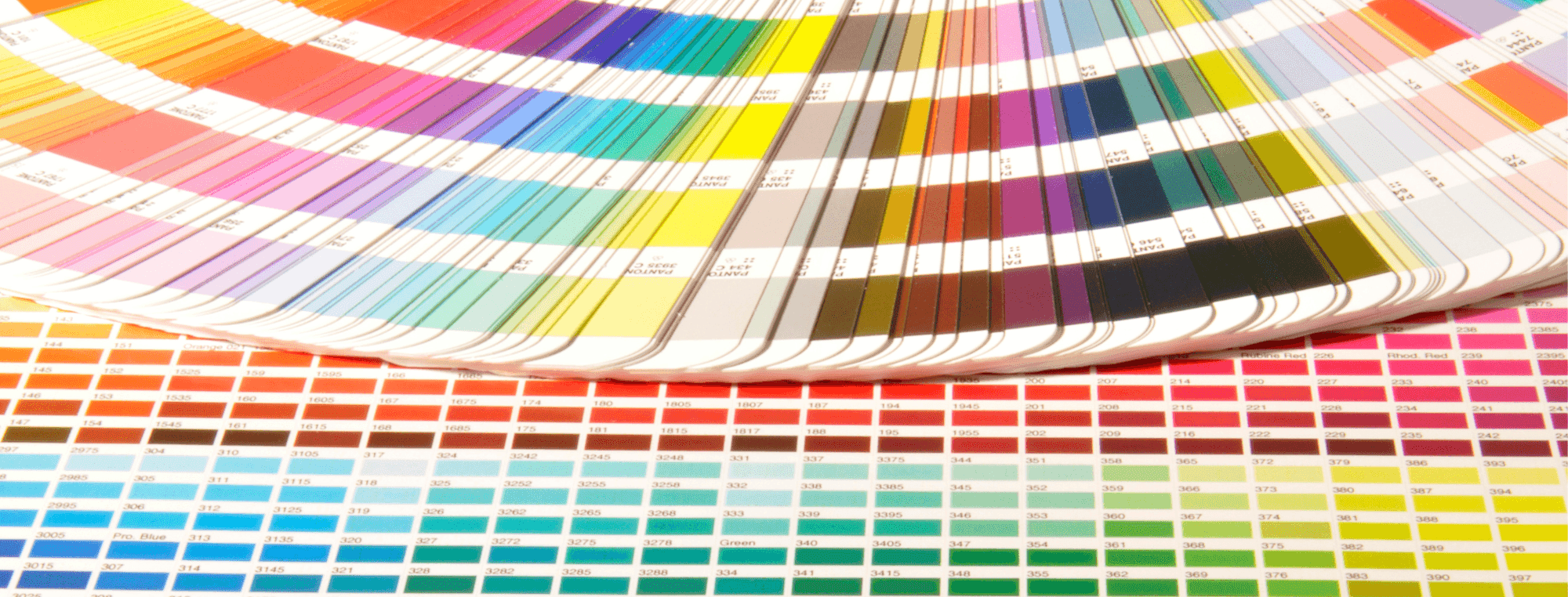
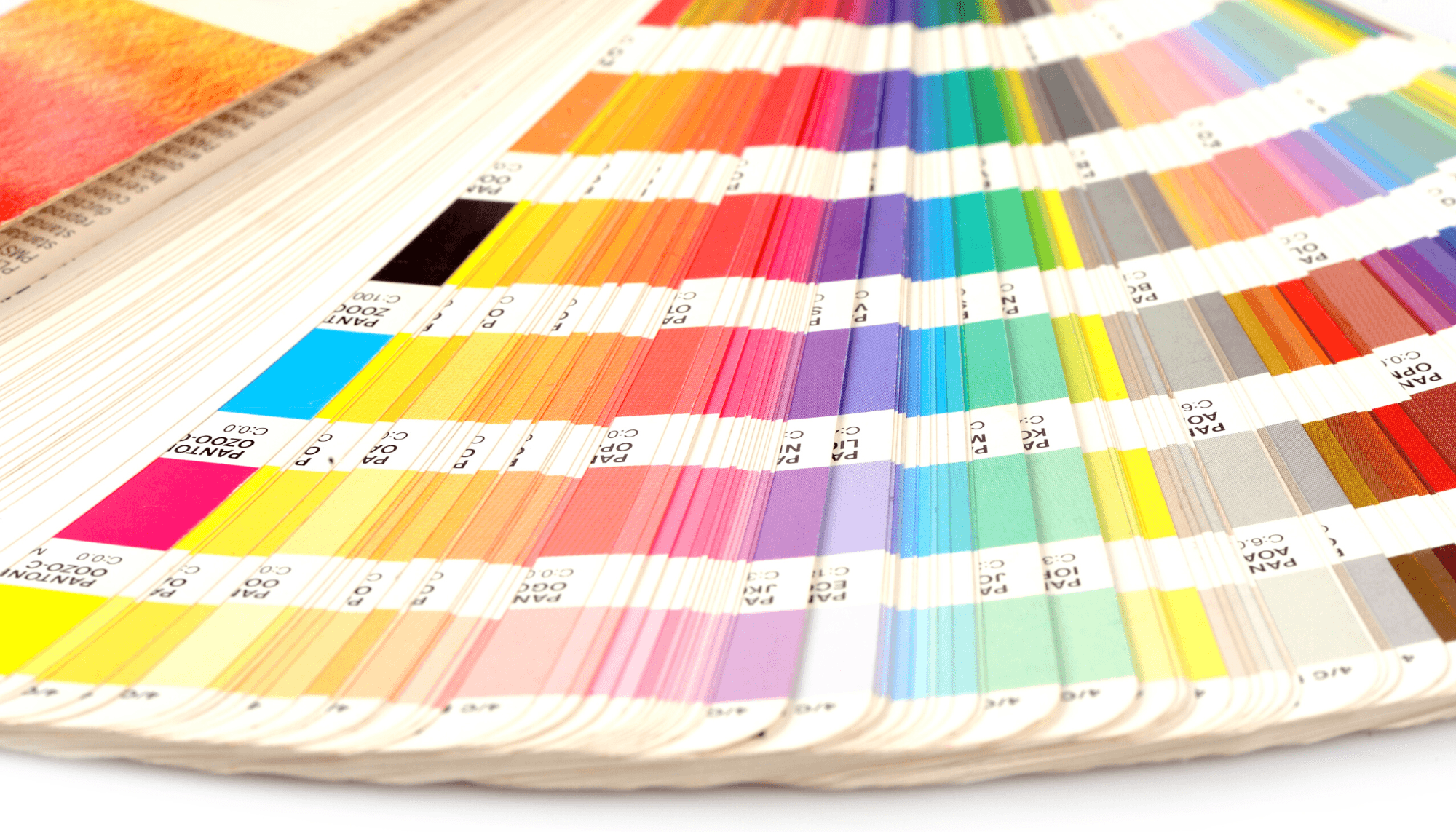
Using the Pantone system is relatively straightforward. Designers and manufacturers can reference the Pantone color guide, which includes a set of physical swatches that can be used to identify and select specific colors. Each swatch is identified by its PMS number, making it easy to communicate color specifications to printers and other manufacturers.
To get or use the Pantone system, there are two primary options: the physical Pantone color guide and the Pantone online system. The physical guide includes a set of swatches that can be used to identify and select specific colors. The guide is available for purchase from the Pantone website or from third-party retailers. Using a physical Pantone book that is in good condition is by far the best and most accurate way for most designers and brands to ensure color correctness for printed designs (such as labels, screenprinting, etc).
The Pantone online system is a digital version of the Pantone color guide that can be accessed online. This system allows designers and manufacturers to search for specific colors, view color swatches, and download digital versions of the Pantone color guide. The only downside to this option is that colors look different on a computer screen than they do in a Pantone book because of the backlight and various contrast and temperature settings that differ from screen to screen.
Conclusion
The Pantone Matching System is an essential tool for designers, printers, and manufacturers involved in packaging design. By using the Pantone system, designers and manufacturers can ensure consistent and accurate color reproduction across different materials and printing methods. The Pantone system is available in both physical and digital formats (though the physical form is more accurate), making it easy to access and use for anyone involved in packaging design.
For more information about Pantone, you can visit the Pantone website, or contact our team with questions.