


Picking Perfect Color for Perfect Packaging

Welcome
Shhhh. What you are about to read is the most closely guarded secret of successful packaging design. Corporate enterprises, packaging empires, and product lives have risen, fallen, and been exterminated by the use or abuse of this secret. The power of this secret, once known and employed, can propel you to success beyond your wildest imaginations. The secret of successful packaging is¦ color.
Color is power
You've heard money is power. Well how does one get the money? In the packaging world, the answer is color. Color is what gets your product noticed, and if your product gets noticed, your product might actually get purchased. See? Color leads to purchase. Purchases result in money. More purchases, more money. Money is power.
Every color is powerful
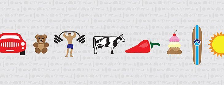
Riddle: Which color is the most noticeable color? Answer: Yellow. Think highlighters, sunshine, yellow slickers, construction equipment, etc. You can SEE them. Yellow assaults the eyes, it reaches out and slaps you in the eyeballs. The answer to getting your package noticed is ¦ wait for it ¦ make it yellow. Right?
Wrong! Color is only a part of the formula to success. Color must be perfectly aligned with design and product to be noticed. If your product's purpose is to slap people's eyeballs, then yellow is the color for you.
Color psychology
Color affects you. It's true. You will want to pick colors that communicate what your product is about. If you are selling a soothing and calming bath oil, you need to pick a soothing and calming color from the greens, blue, purples, and browns palette. Studies show that yellow, red and orange are not soothing colors.
At the end, we've included a profile for each color and what they mean to us. Read it, it can help you narrow down what colors you should use in your packaging.
How to choose the right colors
One way to pick color is to check out the selling environment”the grocery store, the boutique, the department store, or the flea market, and do a study on the products that you will compete with. If you're selling a barbecue sauce, go to the barbecue sauce aisle and study what's there.
Here's the tough part. If you're going to sell your sauce, you've got to look like a sauce, but you've got to stand out from the others. NOTE: Successful products look like they're supposed to and yet stand out, just a bit. When you're in the sauce aisle, identify the products that stand out to you, figure out why, and then do it better on your product.
Coordinating colors
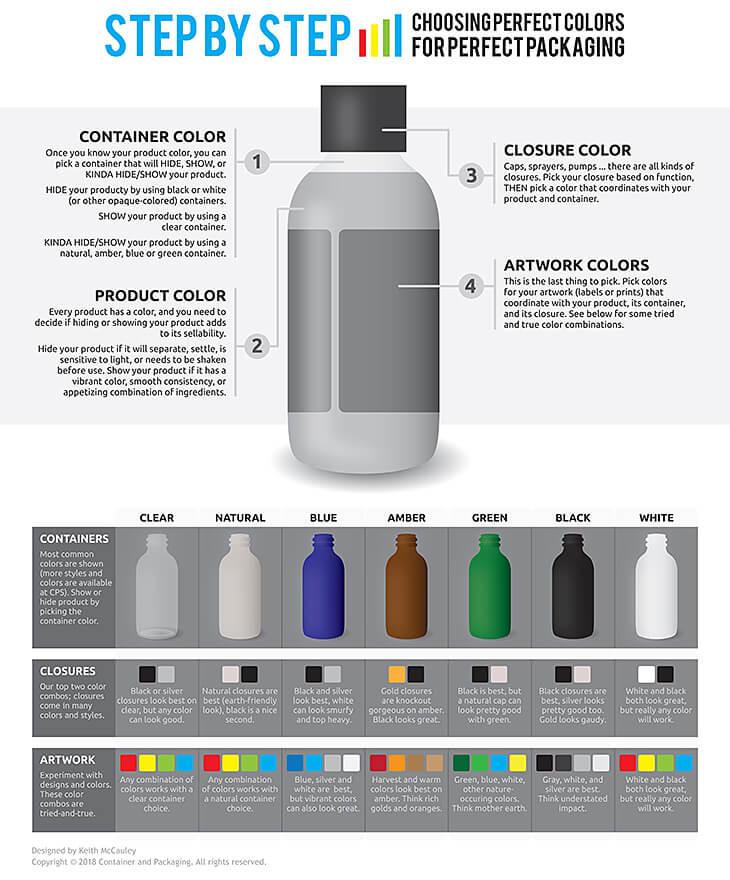
There are a lot of colors to consider when coordinating your package: the color of the container, the closure, the label or print, and the product. Here's a table of our recommendations for tried-and-true color combinations using products you'd buy
from Container and Packaging.
What colors “mean”
 | Black is the color of power and authority. Black is popular in clothing and fashion because it has a slimming effect. It can also denote submission (priests showing submission to God), evil (in the case of villains), decay and death. Black is often used to portray simplicity, minimalism and masculinity. It is also the “go to” color for almost everything because, like white, it is the ultimate neutral. |
 | White symbolizes purity, innocence and simplicity. White can be partnered with any color because, like black, it is the ultimate neutral. White clears the mind, and enables a fresh start (think of a blank piece of paper). It is the antithesis of clutter and chaos. White can also be seen as sterile … clean yet lacking life. Think hospitals. |
 | Red is the most powerful color. Red represents aggression, appetite, activity, and love. Red is an extreme color and is easily noticed. It is used a lot in restaurants and dining to stimulate appetite. Red increases enthusiasm, energy, and confidence. Pink (which is red with more white) has almost an opposite affect. Pink is a tranquilizer. |
 | Orange is one of the most controversial colors. Orange evokes a “love it/hate it” response in a lot of people. Orange, like red, stimulates activity, appetite, socialization, and creativity. It is bright and cheerful, getting the notice that red does without the aggressive undertones. Some shades of orange have broader appeal: peach, rust, tera cotta for example. |
 | Yellow is a cheerful color, yet it should be used with caution. Yellow is the most difficult color for the eye to process. People lose their tempers and babies cry more in yellow rooms (time to repaint the nursery). Yellow aids concentration and speeds metabolism. Yellow symbolizes happiness, cheerfulness, optimism, but also illness and decay. |
 | Green is the most visible color to the human eye and is second only to blue as a favorite color. Natural greens are calming and refreshing. Green represents nature, organics, sustainability, peace, relaxation, health, harmony, wealth, and fertility. Some greens, however can seem institutional (money, government), or have undertones of illness, slime, or envy. |
 | Blue is the most popular color, and the most gender generic. It is the color of the ocean and sky. Blue is calming and relaxing but can also be seen as cold, uncaring or depressing. Blue is an appetite suppressant, historically blue foods were poisonous. Not all blues are sedate, however, bright blues can be seen as electric and exhilarating. |
 | Purple is the combination of red and blue. It is a dichotomy of aggression and calm. This can create a sense of uneasiness unless the undertone (is it more red or more blue) is clear. Purple connotes luxury, royalty, wealth and sophistication. It is also a feminine color and romantic. It can also appear artificial since it is rarely found in nature. |
 | Brown is the color of reliability and stability. It is the color of our earth and evokes feelings of wholesomeness, nature, order, health and vitality. Brown can also be somber or wistful. This effect can be reduced by partnering it with oranges and reds. Light brown can be lighthearted, whereas dark browns like wood or leather are more hearty and somber. |